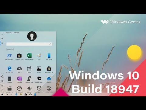
There's much outcry happening on Twitter and other online forums over Windows 10's new unfinished Start menu design. Spotted origina...
There's much outcry happening on Twitter and other online forums over Windows 10's new unfinished Start menu design. Spotted originally by Twitter user NTAuthority and eventually by Windows Central, the new Start menu is found in a leaked internal release of Windows 10 numbered Build 18947. The new design ditches the two-column approach with Live Tiles for something more rudimentary and unappealing. But we suggest you consider what you see with a pinch of salt because it's not the finished design.
Start. pic.twitter.com/3QvWGPdQW9
— NTAuthority (@NTAuthority) July 24, 2019NTAuthority shared two screenshots last evening: one that shows the new Start menu in Windows 10's default desktop mode and one that shows the new Start menu in Windows 10's Tablet mode. In either case, the iconic Windows menu is nothing like what we currently know it to be. Retaining only the slim hamburger menu on the extreme left, the menu loses the two-column architecture and settles for an Android app drawer-style look. Oh, and it also has no Live Tiles, a feature Microsoft introduced in Windows 8.
Start in tablet mode. Meh. pic.twitter.com/Ou7o7ol5g2
— NTAuthority (@NTAuthority) July 24, 2019The icons of all the installed apps and shortcuts show up on the new Start menu as unnaturally large blocks, as if someone has turned on the Magnifier accessibility tool only for the menu. Fortunately, as it's demonstrated in Windows Central's video, there's an option to take you back to the old Start menu look. The biggest difference between the Start menu in the default desktop mode and the one in Tablet mode is the placement of the entire menu. In Tablet mode, the same Start menu appears in a transparent full-screen window so the icons are more accessible.
The new Start menu also seems to place more emphasis on the user icon, which is normally found on the hamburger menu as an icon of regular size with the user's picture. In the new version of Start, the user icon is significantly larger and at the top, where it's easily found. This is not the case in the Tablet mode though. At any rate, it's hard to say if Microsoft will pursue this design for its final build. If it does, then it may spell the end for Live Tiles. We'll just have to wait and see what Microsoft does with this new design.
from Latest Technology News https://ift.tt/2LCGOc5


COMMENTS